Working together to imagine a zero emission future by 2040
Enabling the residents of Ku-ring-gai to reduce their carbon emissions
Product
Website
Task
Use the gathered data, to make a tangible product
Role
UX/UI
Deliverables
Interactive Prototype, UI, Stakeholder interviews,
"I would like to do more but don't know where to start"
Martin, 64, Pymble
What we did
We designed a mini website, accessed through the main navigation. On arrival, users are presented with a set of context setting questions, which funnels them to a personalised solutions page . We discovered, the current website presented a barrier between the residents accessing relevant, digestible, actionable information. Our solution closes that gap, and empowers the user to make a real change in their carbon reduction
Meetings
2
Focus groups
5
Design sprints
1
Prototypes
2

Ku-ring-gai Netzero intiative homepage
The challenge
The Ku-ring-gai Council website have a sub category with information about the Net Zero Communities program. They have recently undertaken research into how to encourage the community to participate in their programs. Our challenge is to translate the findings into actionable solutions. This could happen digitally, through workshops, and/or through other mediums. It requires understanding how real people want to receive information and understanding how to get the community excited about, and engaged with the program.
The current experience
A heuristic evaluation of the current website, revealed current problems with the ui and the overall experience. The blue line represents the trajectory our users go through.

Resident customer journey mapping
On arriving on the website the initial problem, is where do I start looking. It's relatively hidden,for an iniative that has a high profile, it’s buried, within a tab on the secondary navigation. Once the appropriate page has been found, the info is dense, and hard to distill.
Edith J, 58, Turramurra

Kuringai Council website mapping
Who are we designing for, what problem are we trying to solve
At the outset, we knew there were three, distinct groups of people we were targeting, and they sat at opposite ends of the scale

Target market
Our archetypes: the asset rich empty nester
Analysis of household income levels in Ku-ring-gai Council area in 2021 compared to Greater Sydney shows that there was a larger proportion of high income households (those earning $2,500 per week or more) and a lower proportion of low income households (those earning less than $650 per week).
The climate conscious apartment dweller
The total number of dwellings in Ku-ring-gai Council area increased by 2,811 between 2011 and 2016.
The largest changes in the type of dwellings found in Ku-ring-gai Council area between 2011 and 2016 were: High density (+2,860 dwellings).
Do what I say…not what I do
The research revealed conflicting priorities...on the one hand, the residents were concerned and motivated to reduce their carbon emissions, as seen by the large number of positive survey respondents, on the other they enjoyed the comfort of having back yard pools (e.g), and were reticent with council proposals to increase street tree coverage. On the whole however, they were motivated to make a change, but did not know how to and were largely unaware of the councils existing programs and tools to do so.

Target market habits
The bit in the middle…finding synergy
Thats where we put our focus....balancing the needs of the residents, expressed through the survey, and the needs and requirements of Ku-ring-gai council. The overlap…was the opportunity, where we could most effect change, we worked to 3 principles:
1. Enable quick access to the information they need, when they need it.
2. Change the tone of voice of the website, substituting the current clinical language with empowering “I can, I want” statements.
3. Foster a sense of community spirit
Creating a mvp: feature prioritisation
As a team we conducted a prioritisation session. We balanced the needs of the Ku-ring-gai residents and the Ku-ring Council against what could reasonably be explored within a 3 week sprint.
Some features and functionality were non-negotiable such as the “Onboarding Quiz”, which streamlined content a resident might be interested in. Also the re-organising of content into more smaller more mangeable chunks of information. We added the The Community forum functionality, to allow residents to engage with an expert., as this was a requirement both the council and residents had asked for.

Target market habits
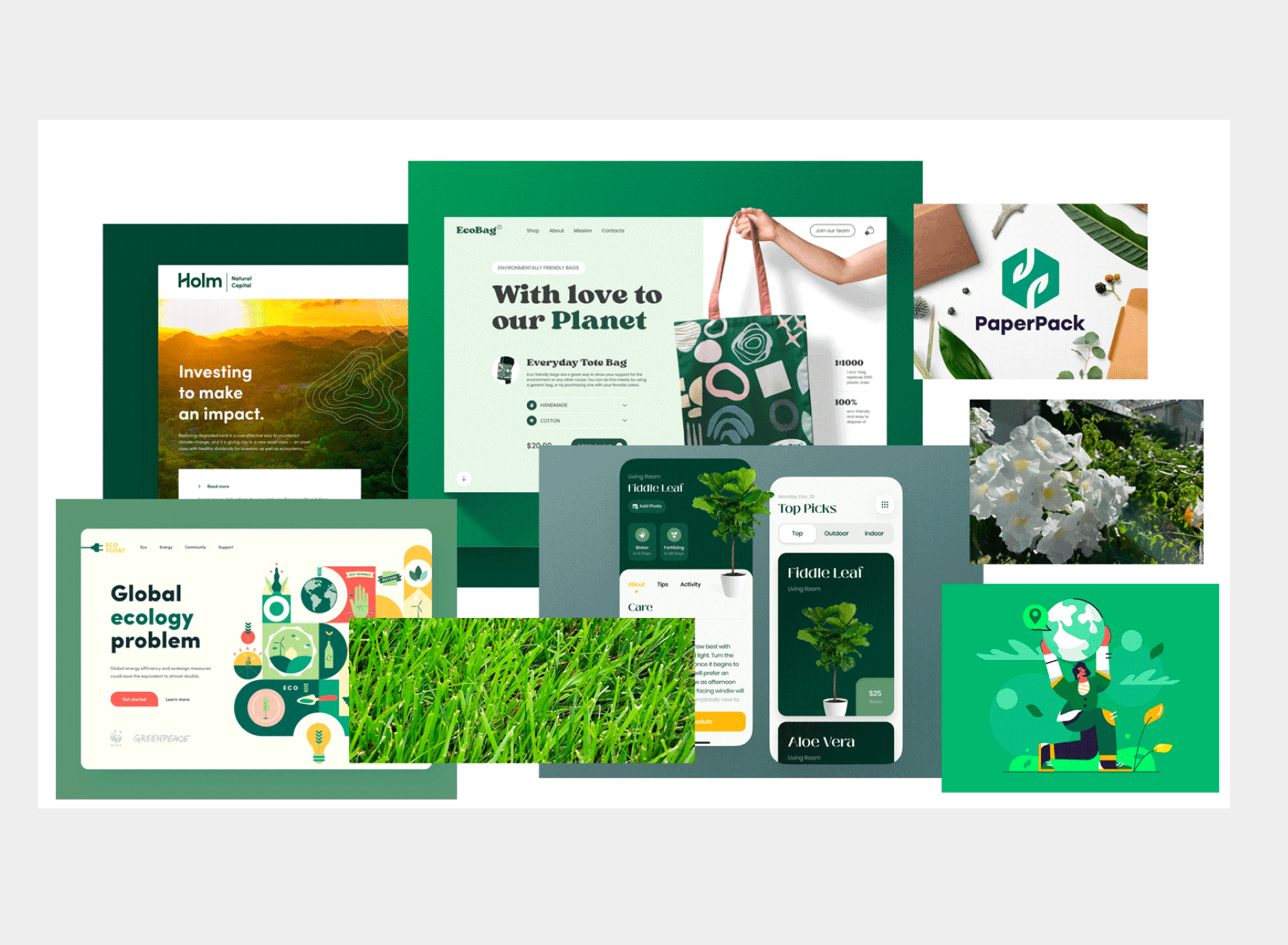
The solution: paper prototyping and inspiration
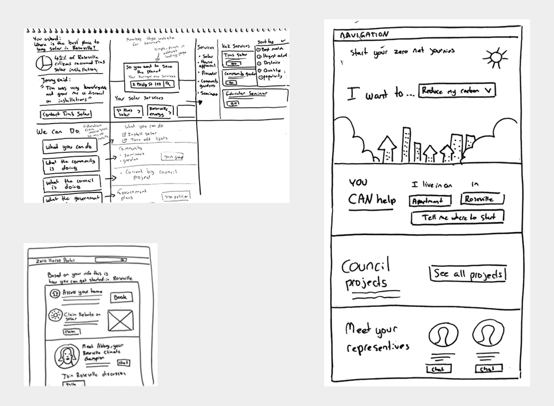
The paper prototypes allowed us to quickly ideate and design user flows using hand-sketched “screens” . In particular we wanted to visualise how the onboarding quiz and the contextual results page might work.
Ideation of homepages
Moodboards
Improved user journey
The new user journey, improves on the current customer journey, by allowing users quicker access to the information they need, is less reliant on technical terms. And although there is still a period of time betweeen the initial customer request and response, that time can now be utilised by allowing acess to the community forum page, whereby users can pose questions of fellow residents, Ku-ring-gai staff or local community champions.
The solution
Our solution involved making the most of the council’s content. This meant finding a way to filter content that was only relevant to the individual.
We had to cut through the noise and only show people what they needed to see.
Finally, it needed to be a positive and empowering experience for the user.

Mobile site..homepage

Learning about the user

Learning about the user

Lorem ipsum dolor sit amet

